A Note on Individual Variation
Not every Deep Winter experiences black or white the same way. Some find pure black too stark or true white too bright—especially those on the neutral-cool end of the spectrum. That’s why personal experimentation and fine-tuning are so valuable.
Your palette is a compass, not a cage. Start with these recommendations, then refine. Icy doesn’t have to mean blinding. Rich doesn’t have to mean harsh. You’re allowed to adjust.
Fashion & Style for Deep Winter
Translating the Deep Winter palette into confident personal style means embracing intentional contrast, rich color, and clean design. Your natural drama deserves outfits that reflect your depth—without softening your edge.
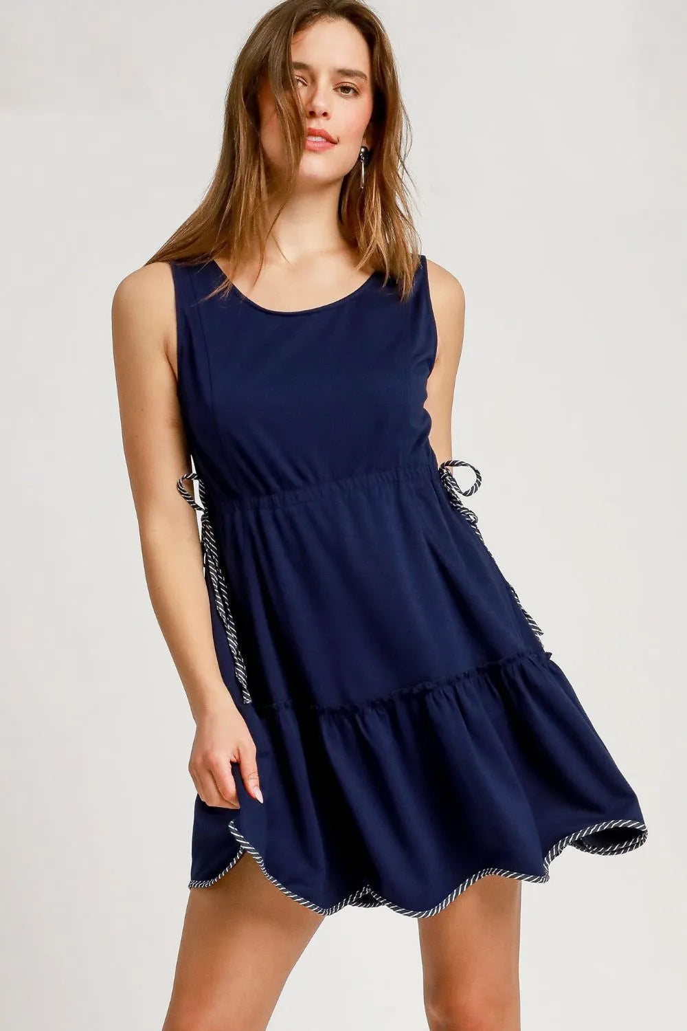
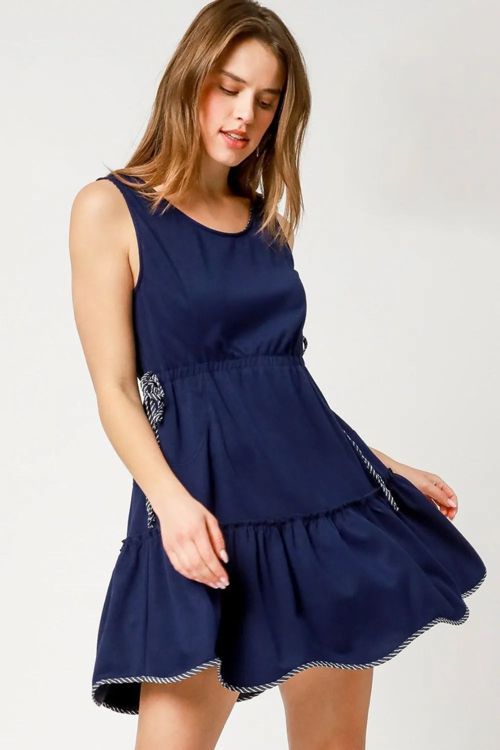
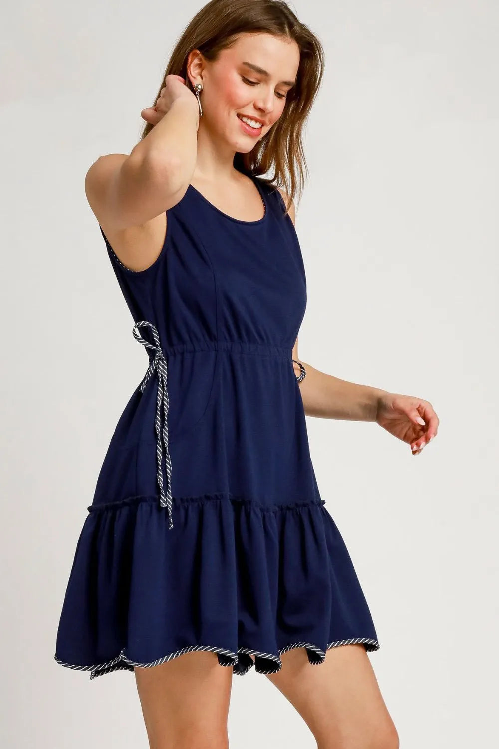
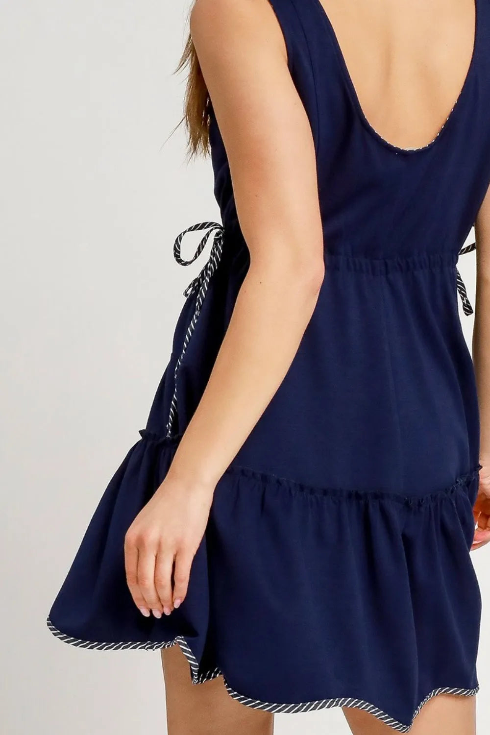
Clothing Colors: Create Intentional Contrast
Deep Winters thrive in bold, saturated hues—and your wardrobe should reflect that. Prioritize rich statement colors like crimson, emerald, or cobalt, and anchor them with deep neutrals like black or ink navy.
For balance and impact:
- Pair light vs. dark and color vs. neutral to echo your natural contrast.
- Try a vivid fuchsia blouse with deep forest trousers, or a head-to-toe look in rich sapphire.
- All-dark outfits—like charcoal layered with black cherry—add elegance and mystery.
For professional or polished looks, skip soft pastels and warm browns. Instead, use powerful accents (like wine or royal blue) to add clarity and edge.
Patterns: Bold, Smooth, and Stylized
Deep Winters shine in patterns that are visually strong—but not harsh. Think contrast, not chaos.
What works best:
- Bold, stylized prints with cool undertones
- Abstract shapes, elegant geometrics, or artistic motifs
- Smooth transitions in color rather than jagged stripes or stark checkers
flatten your contrast.
Look for prints that feel dramatic and intentional—bold enough to match your features, but with a smooth, polished finish.
Fabrics: Saturated and Sleek
To bring your palette to life, choose fabrics that hold color well and support clarity.
Recommended:
- Crisp cottons, gabardine, silk blends, ponte knit, and satin
- Smooth textures that reflect light and amplify bold hues
- Lighter-weight fabrics in summer, as long as they’re cool and clear
Avoid:
- Fuzzy or washed-out textures
- Muted knits or anything overly slubbed, heathered, or dusty
Jewelry & Accessories: Cool Metals Win
Your features pair naturally with cool-toned metals. Silver enhances your undertone and emphasizes contrast beautifully.
Go-to metals:
- Sterling silver
- Platinum
- Chrome or pewter
- Brushed or polished finishes—both work
If you wear gold, choose antique or dark versions with very low warmth. Bright yellow gold, bronze, or copper can compete with your cool tone.
Style takeaway: Deep Winter fashion is high-contrast and unapologetically bold—but it’s also precise. Think sleek, saturated, and strong. The right outfit doesn’t just complement you—it reflects you.
Makeup & Hair for Deep Winter
Your coloring already brings intensity—makeup and hair choices should enhance that power, not compete with it. The right shades help you look vibrant, polished, and aligned with your natural contrast.
Complexion: Start with a Clean, Cool Base
- Foundation: Use cool or neutral undertones (pink/blue base).
- Finish: Satin or matte is ideal.
- Avoid: Yellow-based or overly dewy foundations that can clash with your undertone.
Blush & Bronzer: Sculpt with Cool Tones
- Blush: Choose rich cool shades like dark rose, plum, berry, raspberry, and cranberry. Apply lightly if you're fair-skinned.
- Bronzer: Generally not needed. If used, choose cool, muted tones for contouring—never orange or warm bronzers.
Eyes: Frame with Depth, Not Warmth
- Eyeshadow: Stick to smokey tones, charcoal, emerald, plum, and icy highlight shades (cool pink, light gray, champagne beige).
- Eyeliner: Go bold with black-brown, graphite, deep navy, or eggplant.
- Mascara: Use black or very black only—brown is too soft.
- Brows: Enhance your natural shape using cool-toned shades like ash brown or charcoal. Avoid golden or warm browns.
Lips: Where the Magic Happens
- Best shades: Deep fuchsia, cranberry, dark cherry, cool maroon, cooked beet, rich plum, blue-based crimson, dark wine.
- Finishes: Matte and satin are ideal; gloss or lacquer works if color stays intense.
- Avoid: Warm red, peach, coral, or Barbie pink—they’ll clash with your cool undertones.
Nails: Stay Cool, Stay Vampy
- Choose deep, cool-toned shades like plum, sapphire blue, charcoal, or dark wine. Avoid warm or muted colors.
Hair: Respect Your Natural Depth
- Best natural tones: Neutral medium brown to true black.
- If dyeing: Stick with cool, dark shades—espresso, black, cool auburn, or plum.
- Highlights: Only if high contrast (e.g., cocoa, cherry). Avoid balayage or blended warmth.
- Going blonde: Not recommended—will likely diminish contrast.
- Gray hair: Embrace it! Silver tones look powerful. If black feels harsh, try soot or charcoal instead of warm whites.
Makeup Balance: Drama vs. Overwhelm
Deep Winters naturally bring intensity to every look—but more isn’t always better. If bold eye makeup feels like too much, focus on the lips instead. A clean face with a saturated lip can feel just as strong and more balanced. Experiment to find your personal sweet spot between bold and wearable.
Navigating Deep Winter: Challenges, Misconceptions & Styling Flexibility
Deep Winter is one of the most visually commanding seasons—but identifying it isn’t always straightforward. Between subtle undertone shifts and personal style preferences, many individuals face confusion or misdiagnosis before finding alignment with this palette.
Why Deep Winter Can Be Hard to Identify
Not every Deep Winter presents in the same way. Here’s why the process can be complex:
- Neutral-Cool Undertone Confusion: Deep Winter’s undertone isn’t icy blue—it’s cool with a touch of softness. Many people misdiagnosed as True Winter find a better match in Deep Winter’s richness and slight neutrality.
- Overlap with Dark Autumn: Both seasons are “deep,” but that’s where the similarities end. Dark Autumn is warm and muted; Deep Winter is cool and clear.
- DIY Limitations: Personal color analysis requires more than a filter or a favorite outfit. Even professional consultations can go astray if personal style masks natural features.
- Skin Tone Misconceptions: Light skin doesn’t always mean cool. Likewise, Deep Winter traits appear beautifully across all skin tones—from alabaster to cool olive to deep ebony.
- The Myth of “Anyone Can Be Any Season”: Color analysis is rooted in science. While style is flexible, your undertones, contrast, and natural depth point to clear palette guidelines.
When You Don’t Feel Like a Deep Winter
Sometimes, the palette fits... but the aesthetic doesn’t.
You might love soft, romantic clothing or minimalist neutrals. That doesn’t mean Deep Winter is wrong—it means you need to express it your way.
A Deep Winter with a dreamy, vintage vibe might choose muted silhouettes, but anchor them in cool, high-contrast tones. A minimalist might lean into charcoal, icy white, and rich black, skipping the bolder jewel tones entirely.
Your palette is a tool, not a constraint. The goal is harmony, not conformity.
Common Challenges (and Workarounds)
- Black Feels Too Harsh: Try soft black, soot, or charcoal. These still ground your look without overwhelming your features.
- White Looks Too Bright: Replace stark white with icy gray, stone, or sheer white layers.
- Pastels Are Tricky: Avoid warm or dusty pastels. If you want softness, reach for icy mauve, cool lavender, or pale silver.
- Gold Jewelry Preference: Silver is best—but if gold feels more you, stick to antique or muted finishes, never bright yellow or copper.
- Cool Olive Skin: Some Deep Winters with olive tones may adapt their palette slightly. Focus on clarity and coolness, even if that means borrowing from Soft Summer or True Winter in rare cases.
Tips for Accurate Deep Winter Color Analysis
Wondering if Deep Winter is your true palette? While AI-powered analysis (like the one we offer at Color Capsule) is designed to measure undertones, contrast, and chroma with precision, there are a few ways to spot the signs on your own.
Your Most Reliable Baseline: Lighting Conditions
Before testing anything—whether in person or with a photo—get your lighting right. Even the best palette can look “off” in the wrong conditions.
- Stand in front of a north-facing window with indirect natural daylight.
- Avoid shadows, fluorescent lights, or golden-hour sun, which can distort undertones.
- Remove distractions: tie back dyed hair, remove makeup, glasses, and jewelry.
We recommend following these same conditions when uploading a photo to our analyzer—because accurate light reveals accurate color.
Other Helpful Clues
- Vein Color Test: Blue or purple veins suggest cool undertones (common in Winters).
- Jewelry Test: If silver lights up your face more than gold, you’re likely in the cool spectrum.
- White Draping: Hold pure white and warm ivory beneath your chin. Deep Winters glow in true white—ivory tends to flatten.
- Contrast Check: Convert a photo of your face to grayscale (not just a black & white filter). High contrast between hair, eyes, and skin is a Deep Winter hallmark.
- Color Reaction: The ultimate test: how do Deep Winter colors make your skin look? If they energize your features—versus making you look sallow, flat, or tired—you’re probably in the right place.
Still unsure? Let our AI-powered analysis do the heavy lifting. With precision color sampling and confidence scoring, it’s designed to remove the guesswork and reveal your natural palette in under 60 seconds.
Iconic Deep Winters: Celebrity Style Inspiration
Looking to visualize how Deep Winter style translates into real-world elegance? Celebrity examples provide compelling inspiration. These public figures often embody the bold, cool, high-contrast features typical of Deep Winter—and show how to use the palette to enhance presence, clarity, and charisma.
Examples of Celebrities Who Embody the Deep Winter Aesthetic
Here are some well-known Deep Winters who demonstrate the striking potential of this palette:
- Female Celebrities: Sofia Carson, Gal Gadot, Deva Cassel, Vanessa Hudgens, Monica Bellucci, Catherine Zeta-Jones, Lucy Liu, Salma Hayek, Dua Lipa, Charli XCX, Olivia Rodrigo, Anne Hathaway, Penélope Cruz, and Kim Kardashian.
- Male Celebrities: Djimon Hounsou, Keanu Reeves, Simu Liu, Oscar Isaac, and Adam Driver.
How They Leverage Their Palette
These individuals consistently shine in Deep Winter’s signature tones—rich blacks, charcoals, jewel-toned reds, emeralds, and deep navy. Their features appear most defined and balanced in bold, cool, saturated shades that echo their natural depth and contrast.
They also illustrate what happens when the palette is ignored: warm oranges, mustard yellows, and muted browns often wash them out, clash with their undertones, or draw focus away from their face. Their stylists may occasionally use these tones for editorial effect, but the visual disconnect is noticeable.
It’s also important to remember: celebrities are styled for roles, red carpets, and trends. They don’t always wear their “best” palette—and that’s okay. Color analysis is a tool for empowerment, not a limitation. Even within Deep Winter, some shades will be stronger than others depending on the individual’s exact undertones, contrast, and styling goals.
Key Takeaways from Deep Winter Icons
| Celebrity |
Key Features |
Best Colors / Style Choices |
What to Avoid |
| Djimon Hounsou |
Dark, high-contrast coloring; cool-leaning skin |
Deep blues, silver-gray, black; smooth, cool tones |
Warm oranges, checkered brights |
| Keanu Reeves |
Dark features, strong contrast |
Charcoal, black, deep greens and browns |
Warm, pale, or muted shades |
| Simu Liu |
Deep, vibrant coloring; strong contrast |
Vibrant jewel tones; cool navy and black |
Warm pastels, soft neutrals |
| Oscar Isaac |
Dark, striking features; natural mystery |
Dark blues, charcoals, cool reds |
Warm browns, mustard tones |
| Adam Driver |
Moody contrast, deep features |
Black, navy, charcoal; sharp minimalist tones |
Warm yellow, earthy browns |
| Sofia Carson |
Fair skin, deep brown eyes, dark hair |
Black, deep plum, icy white |
Warm muted tones |
| Gal Gadot |
Cool fair skin, dark brown hair |
Rich, bold jewel tones; navy and crimson |
Earth tones, beige |
| Monica Bellucci |
Deep hair, olive skin, cool brown eyes |
Burgundy, charcoal, emerald |
Muted yellows, warm pastels |
| Anne Hathaway |
Cool fair skin, high clarity eyes |
Emerald green, deep plum, midnight blue |
Warm beige, peach, camel |
Use these celebrities as inspiration, not a prescription. Your version of Deep Winter is uniquely yours. Their palettes work because they reflect natural contrast, not just trend.